Mark has been interested in photography since a very early age (12). However it was not until the birth of his first daughter that he really got into taking photos. At that time he bought his first digital camera and he started to develop a flair for landscape photography.
Winner of several awards in local and national competitions he went on to undertake some courses with some of the UK's most well know Wedding and Portrait photographers. He started to take photos for friends and family (from portraits to weddings) and gradually got better and better at his craft to the point where he is now fully professional.
I am not interested in his wedding shots, rather, I like his urban portraits and this is exactly the type of thing that I am looking to emulate.
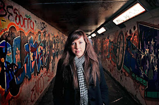
Classic rule of thirds with the subject looking from left to right, this image fulfills many standard techniques.
The lighting is interesting and he must have used some additional flash to remove the shadows of the girl and also to highlight the colours in the graffiti on the walls.
This use of colour adds an extra warmth to the picture, although I cannot help wondering what it would look like on black and white and if it would be more 'moody' in that context.
In complete contrast, this shot highlights the woman in the middle to make her stand out against the background.
There is a lot of interest in the brick in the background and the perspective draws you to look past the subject towards the rear of the photo. However, the use of the light makes the subject dominate the picture.
Using a relatively low angle on the light source has created a very long shadow that curls up the wall to create more interest.
 In this image he has combined both of the techniques in the previous two. He has used the lines of the walls, floor, and ceiling , to create that element of perspective, as the woman looks like she has been projected forwards. Colour explodes in this picture with the graffiti on the walls. However, the woman dominates the image. Centrally placed with the majority of light filling her face and upper body, you cannot help but focus on her instantly.
Using a curved wall adds and element of perspective, but the real beauty of this picture is its simplicity. A wall and a girl - that's it.
In stark contrast to the previous picture, this wall is very dark. Yet again, the girl is in dark leather, so her facial features are exaggerated and she instantly stands out.
Even so, there is a nice texture to the blue wall which adds to the overall image.
Place her on the left, looking out of the photo is not what is normally taught. However, rules are made to be broken and in this instance I believe that the image works extremely well.
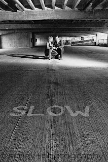
Light is everything in this image. There is much happening in the upper third of the image, with the support structures in the car park. However, the low angle of the image and the placing of the main subjects in the top third, with the SLOW sign in the lower third, proportions the image very nicely.
Putting this image in black and white really works. I would imagine that it would be a very bland environment at best, so rather than spoil the effect with drab colouring, he has been able to exaggerate the blandness by using black and white as his medium.
This image works as it has a great contrast between the brick wall and the wooden doors. The horizontal lines against the vertical lines, really work well. The two elements provide a great sense of texture to the image.
Also, the soft browns of the wall contrast with the greyness of the wooden doors.
Placing the subject in the grey section enables that splash of colour to contrast against the greyness. This would not have worked had he placed the subject against a very colourful wall.
Looking at texture, the bricks in this roof space create a very interesting backdrop. The way that they are not straight (vertical/horizontal) adds a feeling of the image having been shot and then turned through 30 degres. However, the subject is standing upright, so that is a contrast.
Yellow background, blue T-shirt contrasts well.
The lighting is interesting as the model is well illuminated form the front, but there is no shadow on the bricks behind, so that is something to think about when creating my own images.


No comments:
Post a Comment