Well that's it. Done, dusted, and put to bed, I hope.
Cheers to everyone and good luck with your photography in the future.
Dave
Saturday, 22 January 2011
Exhibitions, Galleries, and Displays
Exhibitions and Galleries are not the preserve of artists. Many exhibitions are held, in galleries, for prominent photographers. Size and scale are essential considerations in such environments. A massive canvas print on very large wall can completely fill the space.However, a small picture on a similar wall will also create a high level of interest and can be equally as powerful.
Today there are many photographs that are printed onto all sorts of different materials, the choice of which will help to determine whether a particular image needs a frame or not.


However, the printed material is only one aspect. Certain images may need a frame to give them the finish that the photographer requires, or to enclose the subject matter.
Should you choose to put a frame on an image, you then need to think about the colour and style of that frame. Does your image need mounting within a frame, or will it stand on it's own? Frames can be purchased at specialist framing shops, or you can simply buy small, standard frames from stores like Wilko, Boots, or even Tescos.


How strong is your image? Will is stand on it's own, or will it look better in a collection of images?
 Exhibiting photographs requires an understanding of the space in which they are to be hung and how they will react to the surroundings. Hung on a white wall, the effect will be very different to if the same image is put against a patterned, or coloured wall.


All in all, there is a definite skill in exhibiting your images to maximise their impact. The final solution can only really be created once:-
Today there are many photographs that are printed onto all sorts of different materials, the choice of which will help to determine whether a particular image needs a frame or not.


However, the printed material is only one aspect. Certain images may need a frame to give them the finish that the photographer requires, or to enclose the subject matter.
Should you choose to put a frame on an image, you then need to think about the colour and style of that frame. Does your image need mounting within a frame, or will it stand on it's own? Frames can be purchased at specialist framing shops, or you can simply buy small, standard frames from stores like Wilko, Boots, or even Tescos.


How strong is your image? Will is stand on it's own, or will it look better in a collection of images?


All in all, there is a definite skill in exhibiting your images to maximise their impact. The final solution can only really be created once:-
- You have all of the facts in place and you understand the 'space',
- Know how you want to portray your image,
- You understand your target audience, and
- The impact that you are aiming to create.
Friday, 21 January 2011
Photography Books
There are many themes that can be chosen for photographic books and what you wish to achieve with your book, that will determine the format of your layout.
Books can be used for many, many, purposes. They can be used for holiday snaps, to compile a portfolio, to tell a cultural tale, to discuss a topic, or virtually anything. A wedding album, or photograph album, is really just a book by another name.
Once deciding what kind of book you are looking to produce, you then need to think about the setting of the photographs. Do you make each photo a single page, or do you want multiples in order to create additional, or different interest on a single page.
I travel a lot, and I use photographic books to enable my friends and family to see where I have been. It is great to be able to sit at the computer and review the images that you have taken, and with various websites you can reach millions of people with your images, if you want to.
However, not everyone wants to sit at a computer and therefore publishing on line is not necessarily the best medium for sharing the pictures with others. Hence I have a number of books that sit on a coffee table, that my family and friends can look at if they wish.
In these, typically I will add several images to a page, but will mix and match sizes to create the best effect and to tell the most I can about a place, or a situation, within a single, or double, page.
 For greater effect, or to relate a particular scene, you can span a couple of pages
 As well as the images themselves, you need to think about the type and quality of the paper to be used and the backgrounds to be applied.
Great emphasis can be applied to images by the use of coloured backgrounds. In the image below, I was standing inside a church, which was dimly lit. The light outside was so bright that I was able to capture the image and with the settings employed, managed to ensure an almost black background. Using a black page, I was able to exaggerate the emphasis on this particular image.
 Positioning the doorway on the right also draws your eye to the right. Add to this the fact that this was published on a right-hand page and as you turn the page over, you are instantly met with the vision through the door.
Books can be published from all over the internet or from places like Boots, Jessops, and many other High Street outlets.
I chose not to publish my images within a book, as I did not want to restrict the ability of my classmates to be able to view them too. Books are excellent and there is a time and a place for them, but (cost aside) I decided that this was neither the time nor place for presenting my images in this way.
Books can be used for many, many, purposes. They can be used for holiday snaps, to compile a portfolio, to tell a cultural tale, to discuss a topic, or virtually anything. A wedding album, or photograph album, is really just a book by another name.
Once deciding what kind of book you are looking to produce, you then need to think about the setting of the photographs. Do you make each photo a single page, or do you want multiples in order to create additional, or different interest on a single page.
I travel a lot, and I use photographic books to enable my friends and family to see where I have been. It is great to be able to sit at the computer and review the images that you have taken, and with various websites you can reach millions of people with your images, if you want to.
However, not everyone wants to sit at a computer and therefore publishing on line is not necessarily the best medium for sharing the pictures with others. Hence I have a number of books that sit on a coffee table, that my family and friends can look at if they wish.
In these, typically I will add several images to a page, but will mix and match sizes to create the best effect and to tell the most I can about a place, or a situation, within a single, or double, page.


Great emphasis can be applied to images by the use of coloured backgrounds. In the image below, I was standing inside a church, which was dimly lit. The light outside was so bright that I was able to capture the image and with the settings employed, managed to ensure an almost black background. Using a black page, I was able to exaggerate the emphasis on this particular image.

Books can be published from all over the internet or from places like Boots, Jessops, and many other High Street outlets.
I chose not to publish my images within a book, as I did not want to restrict the ability of my classmates to be able to view them too. Books are excellent and there is a time and a place for them, but (cost aside) I decided that this was neither the time nor place for presenting my images in this way.
DVD In - Hurrah!
After many trials and tribulations, I have finally managed to 'hand in' my final images for review. Given that the files were so large I ended up having to put them onto a DVD with a 4.7Gb memory capacity.
I chose Assignment 208 as my project for the course and entered two categories, People & Places and Nature. I have presented the workings within my blog, as can be evidenced by reviewing the blog in detail. However, to provide the final images for review, I put them into two folders on the DVD as below and labeled each accordingly.

Within Each folder I retained the original images of my final selections, to enable the examiner to see how I had arrived at my final ten for each category.

The final images were stored within the 'Finished Folders' file, each within their own folder too.

Within each file I have included an original RAW file and a JPEG of that image too. In addition, there is a final image Photoshop (psd) file and also a JPEG of the final image. Supporting the Photoshop work I have also included Screen Dumps (SD) in sequence so that it is easy to follow the progression of any adjustments made.


Finally, as an overview, I included the complete set of final images within their own folder as individual JPEG's.


All that remains now is for me to complete Assignment 211 and I'm done.
Thursday, 20 January 2011
Online Printing Services
Printing photos allows you to display them in various formats and in numerous sizes. They can be printed as small photographs, for including into a photo album, or for mounting into frames for putting on the wall. How you ultimately wish to display them will determine the size of image that you will want to order. Alternatively, you can have the images printed onto canvas, or blown up as large format images, for mounting onto frames.

There are a myriad of websites that you can visit to order prints on line, ranging from Bonus Print, Jessops, Boots, or other, to even people like Tescos.
Before deciding which format you want to adopt, you will need to have chosen the final image, or images, that you wish to have published. Whether you choose to print in colour, or other, you will need to ensure that the final format chosen is such that it compliments the image.
In addition to having images printed as standard sized photos, or for wall mounted images, you can get pictures printed onto canvas, or blown up as poster images. Pictures can be mounted in groups rather than as single images. Images can be printed onto cups/mugs, or presented on calendars.


By digging deeper into your chosen publishing method, the website will reveal a plethora of information about the detail of the format that you choose. It will give you options as to the exact size of the finished image and the material/paper on which it is printed. In addition it will provide you with a price and you will then have the option of loading your image and ordering the item.
Create a Portfolio
Creating portfolio of your work can be a daunting task. However, if approached in a logical manner it need not be so. The key thing to decide is the theme for the work and then to review your images to make sure that they meet the criteria that you have set for your portfolio.
Once you have chosen your images you then need to decide the order in which they should be displayed. Start string and end strong. It is important that you insert the picture in an order that enables you to make the best of the images that you have. So, start with one your best images and end with yet another of your strongest images; as this will initially set the tone for what is to follow and when the viewer gets to the end, leave them with a great impression of your work.
Literally translated 'portfolio' actually comes from the French porte folio, which stands for 'page carrier'. Folio is a specific size of paper and porte refers to the French word 'carry'. Although the word folio does refer to a specific size of paper, there is no limit as to the size of the pages that can be included within a portfolio or to the sort of materials used to bind and cover the portfolio.
It is a very simple way of keeping themed images together in a single entity. However, the way in which you display the images can vary and will be vitally important in ensuring that the images are presented in the absolutely best way.
- Do you simply insert images into clear wallets?
- Should you mount images on card or other?
- Do you want to use a border or not?
- What about the type of paper used to print the images?
How you insert the images in the portfolio is subject to what you want to achieve. In order to protect the finished images, you may want to protect them by inserting them into plastic wallets within the portfolio itself.
If you choose to mount them, then you need to be sure that you are using a background that compliments the image. Do you use a black or a white background, or would a coloured background be better? This is subject to the context of the picture that is being displayed.
In addition to thinking about how you mount your images, consideration needs to be given as to the type of paper used on which to print the image. Should you use matt paper or gloss paper ? The decision will be arrived at by assessing which type of paper portrays those images in their best light.
The reality is that with the explosion of digital photography, it is no longer essential to print images within a bound portfolio, as your images could be presented on screen. However, there is a pace for both options, subject to what you, as the photographer, are trying to achieve.
The decision will most likely be taken with the specific audience and also the costs involved, in mind. Presenting on screen is a low cost option for presenting digital images to millions of people, via websites like flickr, picasa, and others. However, this may not be the way that you want to go if you were looking to present your images to a 'critique panel' who are looking for printed work, or looking at specific aspects of the images.
A portfolio is a collection of images that are essentially put together as a display. This display however, is restricted in it's viewing audience and is tailored for a specific purpose.
Having studied the requirements of the C&G Photographic Course, Assignment 208, there is no requirement to display a printed portfolio. Therefore, I have chosen to present my portfolio using the web tools that are available to me.
By presenting my work in the blog I am able to show and take comment from the other members of the group. I am also not limited in the size of the images, which can be instantly 'blown up' to reveal additional detail. In addition, you can more easily control the colours and the image that you see on screen is the image that you get - every time.
Thursday, 13 January 2011
Within the scope of the People and Portraits portfolio I had a vision to take some images in front of some graffiti. This was aimed at adding a mass of colour to contrast with the commercial images. This was following the works of Mark Tierney, who uses graffiti to great effect.


The image did look a little pale, so I added a little more redness to the image using a hue/saturation layer and increasing the saturation for the red colour only.

Even after this, the background did not add a lot of additional value to the image so, once more, I was curious to see how it would look in black and white. Therefore, I took the colour out of the image by adding a Hue/Saturation layer and reducing the saturation.


Pinned
Within the scope of my People and Portraits section, I was looking at the works of Joe Miles and Harry Borden and had a mind to create a series of commercial images. The aim was to use commercial settings and colour, to contrast against the drabness of the background.

Using the above image I cropped it to ensure that the final image is set as an A3 document at 300 dpi

The next step is then to take a background copy layer to protect the original.

Following on from this I was not happy with the sliver 'stud' within the chest and decide to clone it out. I then created another copy layer and entitled it CROP as I was using this to crop out the stud.


Once I had done this, I wanted to exaggerate the light onto the model. To achieve this I applied a Gradient fill. This allowed me to darken the edges of the image and leave the centre, over the model, as light as possible.

This allowed me to arrive at the image below, which is significantly different from the original.

Gold Leaf - Blue Sky
Having researched Bill Atkinson I wanted to use vivid colour when creating some of the autumnal images I was hoping to create. Blue skies and golden leaves contrasting against each other. Hence I started with the following image.

As with all images I needed to crop the original to A3 size at 300 dpi.

The next step was, as usual, to take a background copy of the original to protect it.
 Using the clone stamp tool I removed a couple of twigs and blurred images that detracted from the main topic.

I was basically happy with the image and the level of colour in the image. However I wanted to add a little more richness to the colours, which were a little pale. Rather than trying to mess around with levels, I was able to achieve this by reducing the brightness slightly (-8) and slightly increasing the contrast (+ 14)
 Ultimately arriving at the final images as below.


As with all images I needed to crop the original to A3 size at 300 dpi.

The next step was, as usual, to take a background copy of the original to protect it.


I was basically happy with the image and the level of colour in the image. However I wanted to add a little more richness to the colours, which were a little pale. Rather than trying to mess around with levels, I was able to achieve this by reducing the brightness slightly (-8) and slightly increasing the contrast (+ 14)


Leaves in the Park
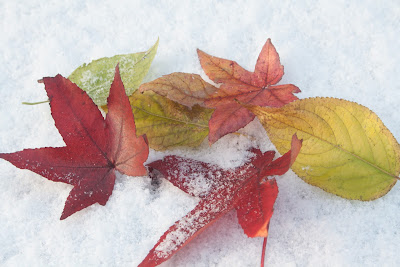
Having chosen the final set of images for my Nature Portfolio it is relevant to describe the steps that I have taken to create the final image of one of these pictures.
There are a couple of steps that were taken as standard with the images to make sure that they are all A3 sized (420 mm x 297 mm at 300 dpi). This was achieved easily within Photoshop by setting the dimensions of the crop tool and cutting the image to make the final image the correct size.


Looking at certain features I decided to remove the stem on the leaf (top left hand side) and to fill in the snow gap in the centre slightly.

The image looked a little flat and I wanted to increase the vibrancy of the colours. Rather than just increase vibrancy in a vibrancy level, I chose to check the levels and took a dropper onto a section of snow to increase the brightness.

This did make the image a little too dark, so I added another adjustment layer to adjust the brightness and contrast. I increased the brightness slightly (+11) and reduced the contrast quite a lot (-30). However, whilst this had the desired effect on the leaves, it blew out the snow, which then needed addressing, as it was simply too bright and lacked detail.

I wanted to darken the image a little so I added a gradient map and then using the eraser tool, removed the leaf detail from this layer. This had the effect of allowing me to work on the snow and the snow alone.


Arriving at the final image as below.

Monday, 10 January 2011
Choosing Final Images - People and Portraits
I wanted to make my theme take a commercial aspect and followed the works of Joe Tierney who uses contrasting colours and textured backgrounds to create a specific look. In addition I have been researching Mark Tierney too. Mark uses colour to great effect in choosing graffiti, or textured, walls to add interest and another dimension to his images.
Bearing this in mind I took a number of images on an industrial park near to where I live. This gave me several images that were good enough to use. My intention was always to try to find some graffiti to add another set of images to compliment the first, but weather and time conspired against me, so I had to consider making do with what I had.
After much searching I chose the following images:

I liked the use of the bright colours and the lines created by the roller shutter doors. However, there were many similar images in these shots and some of them just did not seem to fit. So I trimmed them down to the following:

This left me with a dilemma as there are not 10 images here. After some soul searching I added a couple more back in, but that did notwork and my concerns were echoed in a discussion with Steve on Thursday. So there was nothing for it. I prayed for good weather over the weekend and on Sunday, with a fantastic blue sky and a willing volunteer, I found some graffiti underneath a bridge in Tamworth and was able to take a number of images to complete the portfolio.
The difficulty then, became identifying which ones worked with the previous images. I whittled them down to the following images:

Looking through them and sticking to my original concept, I wanted to use colour in the images, to add additional interest. There were some easy ones to dismiss (there was only one image of my son - so that went). Also, a couple of them were very vibrant, but the area I wanted as the main focal point was ever so slightly not fully in focus - so they went. Leaving the following:

If you look carefully, you will notice that the two images on the left at the bottom are different from their counterparts in the previous image. This is because I was really drawn by the way the light comes into these images and decided that they would look better in black and white. This defeats the colour theory, I know, but the effect of the light is exaggerated as a result, which in itself creates another level of interest.
That left me with six images, from which I needed to choose three. Retaining the colour interest, I removed the B&W duplicate on the middle row and then decided to keep the middle image itself, as it has an interesting pose and shows the colours in the background. That left me with one from three to choose and I decided to retain the very last image as this too had a lot of peripheral colour.
So my last 10 images are as indicated below.

I think that these reflect my original concept of commercial and graffiti and am very much happier with them now, than I was with just the commercial images which I had prior to the weekend.
Subscribe to:
Posts (Atom)