Showing posts with label 208:1 M1. Show all posts

Sunday, 14 November 2010

People and Portraits - Backgrounds

In order to get orgainsed for taking my pictures, I have been walking with the dog this morning and have taken a number of backgrounds that could do well in my final portfolio. The aim has been to get vibrant colours, different texture, and different shades, to provide contrast within the image. All of which I have managed to find within a mile of my front door!

Ideally I am also looking for some graffiti and some concrete too, as this will add to the mix. However, I think that may involve a trip to somewhere like Birmingham.

These were just experimental photos, so I was not too worried about the settings in the camera, as I really was just trying to get an idea of location(s). However, I have included settings for reference purposes.  They were taken quite early in the morning and the sky was cloudy and dull, so the colours are a little bland.
 ISO 800: f/10: 1/250: Lens 18-55mm
 ISO 800: f/10: 1/13: lens 18-55mm
 ISO 400: f/10: 1/100: lens 18-55mm
 ISO 400: f/10: 1/25: lens 18-55mm
 ISO 400: f/10: 1/15: lens 18-55mm
 ISO 400: f/10: 1/80: lens 18-55mm
 ISO 400: f/10: 1/60: lens 18-55mm
 ISO 400: f/10: 1/60: lens 18-55mm
 ISO 400: f/32: 1/13: lens 18-55mm
ISO 400: f/5.6/: 1/13: lens 18-55mm

Thursday, 11 November 2010

Joe Miles

http://www.joemiles.com/

Joe Miles has over fifteen years experience as a professional photographer. Based near Wallingford, Oxfordshire, he has photographed models, politicians and celebrities. His clients include Liverpool FC, Marie Claire, Nivea, The Portland Hospital, The Sunday Times Magazine and Tesco.

Joe specialises in portrait photography for advertising and commercial assignments.
He does all his own printing to ensure the highest standards and uses an excellent local framer, when required. Joe has photographed families from many parts of the UK, particularly Oxfordshire, Warwickshire, Buckinghamshire, Berkshire and London. 

In his location work, he seems to have a simple style using colour to contrast greatly.

The following images had to be screen grabbed, as I was unable to drag them off the website.

Illuminated from the front, the wooden doors in this image have a sheen across them. The subject is almost silhouetted against them.
There is an element of interest within the various catches and hinges, lines and shapes, on the doors that does, detract form the model a little, which is exaggerated by placing the model in the centre.
However, given the darkness of the model you are instantly drawn towards him, as he does stand out from the background.
This image is stark in its simplicity. Two guys against a red wall and nothing. 
It is the plainness of the red in the wall that contrasts so well with the guys in the picture. 
However, they are dwarfed my the mass of red.

Simplicity rules. This is a bit whacky, but the use of colour, the offsetting of the main subject and the starkness of the white wall, all work very well together.
I like the way that this image works. Yet again, vibrant colour contrasts very well with the background. However, in this image, the background too has some texture and interest. Placing the model in the right had third satisfies the rule of thirds. Having said that, he is seemingly walking out of frame, glancing over his shoulder as he goes, and this should take your eye out of the image, but strangely it doesn't and I think this is because he is looking back and you are then drawn into the textures in the background.


Yet again the background is all important here as it sets the tone of the picture. The horizontal lines created by the wooden fencing, or boarding, give a soft texture to the image. 
In this picture however, rather than exaggerating the contrast by having Stephen Gerrard (even I can recongise him)  in bright clothing, he has allowed the face to become the focal point, as this is the only really contrasting element in the picture. As this is such a famous face, then it makes perfect sense to attract the viewer towards it.


The last picture I chose has a lot going on in it. The background, whilst bland in colour, is rich in interest. There are many shapes, lines, textures and other to keep you thinking and looking.
The use of light in this image is interesting too. The model almost blends into the background and she too, as in most of his other images, is looking out of the frame.
this is a dark image that could almost be black and white, but it has an intriguing quality.

Mark Tierney

http://www.tierneyphotography.co.uk/about/

Mark has been interested in photography since a very early age (12). However it was not until the birth of his first daughter that he really got into taking photos. At that time he bought his first digital camera and he started to develop a flair for landscape photography.

Winner of several awards in local and national competitions he went on to undertake some courses with some of the UK's most well know Wedding and Portrait photographers. He started to take photos for friends and family (from portraits to weddings) and gradually got better and better at his craft to the point where he is now fully professional.

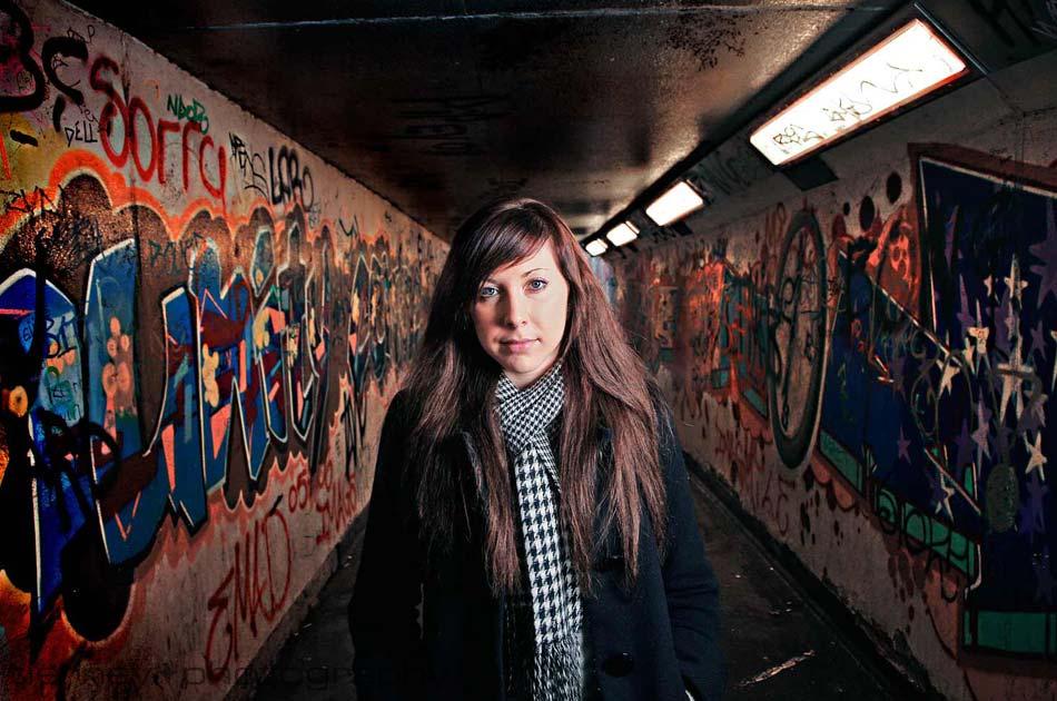
I am not interested in his wedding shots, rather, I like his urban portraits and this is exactly the type of thing that I am looking to emulate.


Classic rule of thirds with the subject looking from left to right, this image fulfills many standard techniques.
The lighting is interesting and he must have used some additional flash to remove the shadows of the girl and also to highlight the colours in the graffiti on the walls.
This use of colour adds an extra warmth to the picture, although I cannot help wondering what it would look like on black and white and if it would be more 'moody' in that context.
In complete contrast, this shot highlights the woman in the middle to make her stand out against the background.
There is a lot of interest in the brick in the background and the perspective draws you to look past the subject towards the rear of the photo. However, the use of the light makes the subject dominate the picture.
Using a relatively low angle on the light source has created a very long shadow that curls up the wall to create more interest.
In this image he has combined both of the techniques in the previous two. He has used the lines of the walls, floor, and ceiling , to create that element of perspective, as the woman looks like she has been projected forwards. Colour explodes in this picture with the graffiti on the walls. However, the woman dominates the image. Centrally placed with the majority of light filling her face and upper body, you cannot help but focus on her instantly.
I am interested in the colours in the bricks contrasting with the woman in the picture. the warmth of the bricks makes the pale colour of her skin really stand out. Indeed the fact that she is wearing a dark leather jacket, which does not stand out, draws you towards the features of the main subject.
Using a curved wall adds and element of perspective, but the real beauty of this picture is its simplicity. A wall and a girl - that's it.
In stark contrast to the previous picture, this wall is very dark. Yet again, the girl is in dark leather, so her facial features are exaggerated and she instantly stands out.
Even so, there is a nice texture to the blue wall which adds to the overall image.
Place her on the left, looking out of the photo is not what is normally taught. However, rules are made to be broken and in this instance I believe that the image works extremely well.


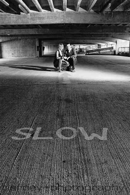
Light is everything in this image. There is much happening in the upper third of the image, with the support structures in the car park. However, the low angle of the image and the placing of the main subjects in the top third, with the SLOW sign in the lower third, proportions the image very nicely.
Putting this image in black and white really works. I would imagine that it would be a very bland environment at best, so rather than spoil the effect with drab colouring, he has been able to exaggerate the blandness by using black and white as his medium.
This image works as it has a great contrast between the brick wall and the wooden doors. The horizontal lines against the vertical lines, really work well. The two elements provide a great sense of texture to the image.
Also, the soft browns of the wall contrast with the greyness of the wooden doors.
Placing the subject in the grey section enables that splash of colour to contrast against the greyness. This would not have worked had he placed the subject against a very colourful wall.
Looking at texture, the bricks in this roof space create a very interesting backdrop. The way that they are not straight (vertical/horizontal) adds a feeling of the image having been shot and then turned through 30 degres. However, the subject is standing upright, so that is a contrast.
Yellow background, blue T-shirt contrasts well.
The lighting is interesting as the model is well illuminated form the front, but there is no shadow on the bricks behind, so that is something to think about when creating my own images.

Ten Tips for Urban Photography

Looking for picture of people within urban space, I happened across this blogsite. It is not clear who compiled this blog, but it has many useful hints and ideas in it.

http://blog.moorephotonc.com/2008/06/27/10-tips-for-urban-photography/

I particularly like the following two images that relate to what it is that I am looking to achieve in my portfolio.
What is particularly interesting in this image is the contrasting backgrounds. The perspective is drawn from right to left with the sloping lines of the garage doors. The main subject (the boy) has a cheekiness about him.

The use of light in the image below is particularly interesting as the subject is back-lit, but there has to be some light in-front of her too as she walks towards the camera. Light is reflecting of all surfaces, the pavement, the wall, the car, and actually from her too.
Single point perspective draws you past the woman in the photo, down the line of the wall, into the far end of the street.

Leslie Alsheimer

Leslie Alsheimer is a photographer of world renown. She is most well known for her works relating to poverty and the human condition. She has been published in many magazines and was recently awarded at FotoWeek DC 2009 with the Professional Journalism Award of Distinction.

She has exhibited in the Corcoran Gallery of Art and has had work published in National Geographic, Black and White Magazine (which is where I came across her work) and many more.

Her work is a celebration of people and the richness of their lives, no matter how materially rich or poor, which is shot in their natural surroundings, showing their real lives. She works hard to capture the human spirit in her work which shines thorough diversity and hardship, showing the real character of the subjects that she photographs.


The simplicity of this image really works.

Ordinarily you would expect photographs of hot air balloons to be taken in colour. Yet again this image works specifically because it is in black and white. The shapes are highly contrasted against each other and are very clearly distinguished.

Leslie took this picture of a 36 year old widow with four children, Nakanyike Agenina, when she stayed with her for a while in her village in the Rakai district in Uganda, known as the "Pearl of Africa". Her husband died of Malaria after contracting HIV/AIDS.
The sheer level of work that Agenina got through in a day and the little amount of money that she had to live off,  inspired Leslie to take a series of photos about her and her family.
This image is striking in its darkness. I love the way that the small amount of light from the candle gives just enough light to enable you to see the subject. You are immediately focused on the candle and then the rest of the picture starts to come into being.
A cluttered image, this works. The lightness of the centre compared to the darkened edges draws your eye to the centre of the image. 

Your eye is drawn to the eye within the image. However, once you focus on the image in the foreground you then are drawn towards the face in the background, which is also looking back at you.
This picture is taken from the 'Sport' portfolio. Yet again it is taken in Africa and the surroundings are minimalistic. You are instantly drawn into the picture by the rope of the boxing ring. The boxer in the background almost goes un-noticed, as he is in the shadow of the light streaming through the windows.

Wednesday, 10 November 2010

Harry Borden

I came across Harry Borden whilst watching the Channel Five TV series "How to take Stunning Pictures" where he did a masterclass for a couple of amateur photographers.
Harry is from New York, but moved to the UK and grew up on a farm in the South West. He studied at Plymouth College of Art and Design before moving to London where he got commissions from the NME and the Observer.
He still works as an independent and provides images to magazines throughout the world. Much of his photography is taken of the rich and famous .
Recognised as one of he worlds leading contemporary photographers, he now has some 100 photographs in the National Portrait Gallery in London.
I have viewed all of the images on his website and come up with the following as they particularly interested me.
 I especially like this image of Ian McKellan (I think), as the light enhances the creases in his face. There is so much interest in the face. The combination of the light and his white air and beard, focuses the eye on his face instantly.
 In this picture the plainness of the whit background really emphasises the contrast of the model.
These two pictures work well independently. On the left, the red of Jimmy's tracksuit contrasts well and adds a serious amount of colour against the white walls. Also, he is boxed in by the lines created by the floor, the wall, the roof over the door, and the support pillar.
The picture on the right captures the zaniness of Jimmy in all its glory. the facial expression captures his personality and the ;ling' with the cigar, and the tracksuit, are all caricatures of his personality.
 Huge irony exists by putting Gordon Ramsay in this setting. As one of the world's most well know specialty chefs to put him in what looks to be a cafeteria works. Also, the food too. Nothing special just simple stuff. In addition the mimicking of his dad, Gordon's son adds a duplicity to the image.


 Harsh lines and the stairwell create a perspective in this image. Off setting Murdoch to the right and lining the wall up to the left, splits the image into thirds (rule of thirds) creating a classic format for the image. The shadows combined with the white walls and black stairs give this image an almost Black and whit equality. Given the subject matter, a person, the eye wanders throughout the picture, following the lines of the shadows, the hand rails and the stairs themselves, after first looking at Rupert Murdoch.
What I like about this picture us the fact that I am thinking of doing something very similar for my assignment, so it is nice to see something professionally done, to compare. The model is slightly offset and the colour in her outfit contrasts massively with he grey wall. In addition positioning is everything. Standing in the image, scantily clad, almost looking like a prostitute there is irony in the grey marking on the wall, which looks like a cross! So we have the contrast between Saint and Sinner, or virgin and prostitute.

Friday, 15 October 2010

The Rule of Thirds

This is a common rule that is applied by many photographers. It works by dividing the image into a grid using two vertical and two horizontal lines, which split the picture into thirds both horizontally and vertically. The ideal location of the subject should be where the lines intersect.
Rather than placing the horizon in the middle, you should place it on one of the horizontal lines. Placing the ubect to one side or the other, on the vertical lines, gives the viewer more oportunity to look into other areas of the image.
As with all of these rules however, they are there to be broken. The trick is to know when.


Black and White - Master monochrome

I am especially interested in B&W portrait photography as, for me, it creates another level of intrigue. So I was doubly pleased when I purchased the Essential Guide to Portrait Photography, to be able to pick up a copy of the above mentioned publication too. This is published by the Digital Photographer crew.
It gives advice and tips on how to visualise the picture in B&W as well as how to set up the composition, with detail about the 'Golden Section' (more to follow), some fine art tips, and an insight into what is perceived to be essential kit.

The Essential Guide to Portraits

Whilst going through yet another airport I chanced upon a magazine entitled as above. Produced by the guys at Digital SLR Photography, it is packed with some very useful hints and expert advice.
Content comprises everything from how to get the correct exposure, to the how to take great mono pictures.

Tuition is given by:
Daniel Lezano (the Editor)
Brett Harkness - one of the UK's leading portrait and social photographers
Bjorn Thomassen - an English born photographer, who specialises in the commercial and social aspects of people photography, and
Paul Ward - a Birmingham based  photographer who specialises in location and studio shoots.

It is not by chance that Bjorn and Paul feature in my blog.