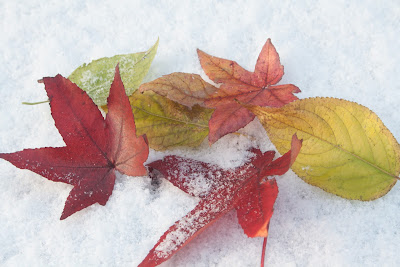
As previously indicated, trying to select the final images has been a particularly arduous task as there are many that I have taken that I particularly like. However, to arrive at the final selection I identified some 45 images and then began to compare and contrast them side by side.
It is not easy, as you are constantly pulling up a couple if images to look at and then comparing two, removing one of them and then repeating the exercise. Through this process I managed to get down to some 45 images. From this 45 I finally, after much serious criticism on my behalf, got down to 25.
Using 'Preview' I was able to get these 25 images onto a single screen and to start to look at what images worked well with each other.
My original thoughts had been based on Autumn. I have seen some fantastic images by the likes of Bill Atkinson, where he has taken really vibrant leaves (reds, and golds) and shot them against superb clear blue skies, to create a riot of colour. Consequently I wanted to create some bright, contrasting, images too. Looking at this as a base on which to build I went through the images, removing items that either did not conjure up Autumn, or did not carry sufficient vibrancy in the colours.
The first images to go therefore, were the flowers. I had done some research into taking close ups of flowers, but this in realty was a distraction, as it took my eye off the Autumn theme. So getting back to the real project they simply did not fit in.
Once again, whilst my images all had pretty much an Autumn theme to them, some of them did not seem to work well with the overall images. There were some lovely flowers taken outside, but they did not work and some brightly coloured berries, all of which were Autumnal images, but they too, simply did not go with the 'leafy' theme that was beginning to emerge.
So berries and all flowers went. Leaving me with 14 images to filter through.
I then had to focus on which images really stood out against each other and to try to finalise, in my mind, what I was trying to portray.
Having been very impressed by Andy Small's use of colour and texture, I wanted to emulate some of that. So I looked for those images that (with a final bit of tweaking) could provide me with that. In addition, I wanted to make the best use of colour and light to create images that stood out and had many vibrant contrasting colours.
The picture of the oak twig in the middle of the screen shot above is very similar to an image by Mark Cranshaw and I had originally wanted to include this within my final portfolio, but when I compared it to the blues and reds, and the brightness of some of the other images, (whilst it does show a good use of light and has good contrasting colours) it simply was too dark compared to the rest - so that was one that went quickly.
There are two images of leaves taken when the heavy frosts came and whilst they are interesting images, they are not vivid enough, when compared to the rest; so they too went. The final image to get removed was the very first one in the selection (top LH corner). I could not get the lighting right and there were simply not enough contrasts to allow it to remain. The image was flat and despite numerous attempts, I was not able to enhance it significantly enough to include it in the final selection.
These are the final 10 images I have selected for my Nature Portfolio. They each have a good range of colour and some very interesting contrasts. Vibrant reds, golds, and blues (as per Bill Atkinson) and the use of white snow, has created a different interest from just the strikingly blue skies.
Some of these images are very simple, with just one or two leaves in them. However, with these, the aim has been, not only to provide a contrast between the colours but, to realise some detail in the leaves, enhancing the texture of the leaves themselves.
Focusing on one or two leaves within an image, has brought certain leaves to the fore, creating a perspective by enabling these items to stand out and blurring the rest. In some images this is more easy to see than others, and this is largely due to the closeness to the subject (standard lens vs zoom lens really), but in all cases, the aim has been to create a focal point on a particular set of leaves to create that depth and to give some perspective.
The set is split into two really, with one set having blue skies as their backdrop and the other using snow as that contrasting colour. However, in all, the vibrancy of the colours of the leaves stands out and it is this, that finally swayed my judgment to making these my final select 10 images.