Showing posts with label 208:2 D1. Show all posts

Monday, 27 December 2010

Botanical Gardnes - Using the Top Ten Tips

Prior to going to the Botanical Gardens with Tony, I did some research on the internet to ensure that I got the best from my time there. However, prior to going the weather turned wintry and we enjoyed an element of snow. Add to this the fact that I was trying to compliment my images of Autumn for my portfolio and the opportunity to take appropriate images became more and more of a challenge.

However, using the tips that I had researched I took numerous images of plants and leaves and tried to apply the techniques reviewed.

Take Pictures from Different angles
ISO 200: f/10: 1/20: lens 18-55mm
ISO 200: f/10: 1/40: lens 18-55mm
These two pictures were taken from two completely different angles. The image on the left gives a much greater depth of field, as the leaves in the background create perspective. However, you lose the full impact of the leaves in the image on the right. In this instance therefore, I have chosen the image on the right as part of my final selection, although I have modified the final image slightly in Photoshop.

Use a good Quality Tripod
ISO 200: f/10: 1/40: lens 18-55mm
To take this shot I had to really lower my camera on the tripod and stand back. The light is not brilliant, but I had to stand away from the leaf, in order to shed as  much light onto the subject as possible. Using my remote trigger, I took the image as seen.


Get Close to the Image, Use a Macro Lens and A remote trigger to reduce camera shake.

ISO 100: f/5: 1/40: lens 18:55mm with 4 x Magnifier

In this image I adopted the advice as above. Using the magnifying filters and the tripod I was able to get very close to the subject.  Add to this the wireless trigger and I was able to close-up images with the minimum of movement.

ISO 100:  f/5: 1/80: lens 18-55mm with 4 x Magnifier
Use Backgrounds for constant colour: Use the smallest aperture size available
I got very close to these seeds and used the widest aperture available given the light conditions. Hence the seeds themselves are very clear, but the background is completely blown out. The clarity of the sed heads is exaggerated by the almost non-nonsensical background which is just a blur of colours with no detail whatsoever. Whilst this will not sit in my final portfolio, I do really like this image.

Friday, 26 November 2010

10 Tips for Taking Flower Photographs

I wanted to do some more research into getting the best out of mine an Tone's visit to the Botanical Gardens in Birmingham, tomorrow. So I have been researching the internet and came up the above named webpage. (http://gardenerstips.co.uk/blog/flowers/10-tips-for-taking-flower-photos/).

1 - Shoot from different angles.
As with most photography, it is recommended that you think about taking the images from different angles. Rather than simply taking them looking down on them, perhaps think about getting down and dirty, taking them from the same height as they are, or even lower, to gain a better sens of perspective.

Taken from above
Taken from the same level as the flower


2. Shoot with the smallest aperture that you lens will allow.
We know this, but it is useful to have it reaffirmed. This will enable me to focus on the flower itself and to blur out the background as much as possible.
3. Try a Macro Lens for a really close shot
Well as neither of us has a macro lens, that will be a challenge. However, Tony has managed ot get hold of some lens 'magnifiers' which screw onto the end of a58mm lens, that should help and I will be looking to 'borrow' them at some stage.
4. Use a good quality tripod
I have every intention of taking my tripod, which is more than up to the task. Working up close , we need to take every effort to reduce camera shake and this is the first step.
5. Other tips to reduce camera shake
a)  It is recommended that if you cannot get your tripod out then take a mono pod (Tone's got one of those)
b) Use a remote trigger. - sorted!
c) Take multiple shots, as the slightest movement could cause you to be out of focus and the more you take the more chance of getting that perfect image - not sure I wholeheartedly agree with the sentiment, but the concept is sound.
6. Canon filter
Well we can only work with what we have, so this may not happen!
7. When to take the best shots
Too much sunlight can blow out the image. You often get better results when the sky is slight overcast as this allows the real colours of the flowers to really come out.
8. The Rain Effect
After it has rained, flowers collect drops of water. This creates an extra romance and beauty to floral photography. However, as it is unlikely to rain tomorrow (it is more likely to snow) we will be taking a water vaporizer to create the same effect.
9. Use backgrounds for Constant Colour
A solid background helps avoid distracting backgrounds. Black often works very well, especially for white, light coloured flowers. We will be more relying on a small aperture as it is unlikely that we will be able to get out bits of card or other to drop behind flower - but it may be worth taking something  - just in case.
10. Wind
Trying to hold stem of flower can work. If you have an SLR set a high shutter speed 1/ 125 will help capture and freeze any blowing wind.
What they are getting at here is that if there is a wind, you need to try to capture the wind effect without blurring the image - we'll see what happens tomorrow then!

Thursday, 25 November 2010

Charles Binns

Born in 1965 in Beaconsfield, Buckinghamshire. Charles is a landscape photographic artist now based in Hertfordshire. With a Spanish mother he spent much of his holidays in Spain and got into photography to record his travels.

He draws a lot of inspiration from the early English landscape artists of the 18th and 19th Century. In those days, artists documented the changing landscape and he likes to think that he is doing the same with his photogrpahy, for future generations. In addition however, he is interested in Macro-photography as he is drawn to the textures and the shapes that can be seen when looking at things close up.

Whilst not averse to digital cameras, he likes to use a Holga camera. This is a simple Camera that relies heavily on the choice of film and the framing of the subject to create the image. With only one shutter speed and one aperture, it surely must be a challenge to use.

Holga cameras are, apparently, prone to create quite a lot of vignetting, blur and 'light leaks' and this can clearly be seen in a couple of the macro images indicated hereafter.

 The grainy quality of this image works really well as it adds to a the blur effect. Looking at the edges you can clearly see the vignetting of the image too.  Hence one woudl assume thatthis was taken with a Holga.

The focal point sits right on the stamen of the flower and the soft lite draws you this too.

The image is 'dark' and velvetty, rich and warm.
Centre stage, two bright red berries, contrasting heavily against the green leaves.
I love this picture, which I haard a guess was also taken with a Holga camera as it has many of the qualities of the red flower at the top.

A soft texture is created by the blur and yet again there is vignetting of the image, drawing our eye away from the edges and into the middle of the image.
 The contrasting yellow leaves and the brown background in this image give a simple look.


I am not sure what lense was used to take thisimage, but it must have been taken with a very wide aperture. the tip of the rose is in focus, but the remainder is out of focus.

With the light background the dark red/black rose really stands out.

Compare and Contrast - Bill Atkinson

Having reviewd Bills work, this is exactly the kind of images that I was trying to recreate with my 'Autumn ' series, as previously posted and I have inserted one of them below to compare and contrast.
my vision was to take brightly coloured leaves against copper sulphate blue skies, to exaggerate and highlight the colours in those leaves.

Catching the right light is essential so I made sure that we had clear skies and plenty of sun, then I set off into Hopwas woods (as usual with dog running around). I took a number of images, as previously displayed and have inserted one of them below to contrast with the an image from Bill's portfolio.

ISO 100: f 9: 1/200: lens 55-200mm                     
I have not undertaken any post production work on my image, but the concept is very similar. Golden leaves against a blue sky. Clearly however, I have focused on a smaller section of the tree, largely due to the peripheral surroundings, which would not have leant themselves to taking a more 'distant' shot.

Bill Atkinson

"Photography begins not in the camera but in the mind and the eye. The real work is one of noticing and appreciating, seeing things clearly and differently, and sharing that vision with others."

Bill Atkinson has spent over 40 years in the world of photography. From an early age, he began taking clips out of magazines and appreciating the way in which images are created.

He attained an undergraduate degree from the University of San Diego (California) where he met Apple Mac developer Jeff Raskin. He continued his university studies as a Graduate at the University of Washington.

Bill was a pioneer within the digital imaging revolution having originally been a computer engineer, working for Apple between 1978 and 1990. As a member of the original Macintosh team at Apple Computer, Atkinson designed much of the initial Macintosh user interface and wrote the original QuickDraw, MacPaint and HyperCard software.

After spending years developing software to assist others in their creativity, he is now furthering his own art, increasing his control and the accuracy of his work through enhancements in digital processing.

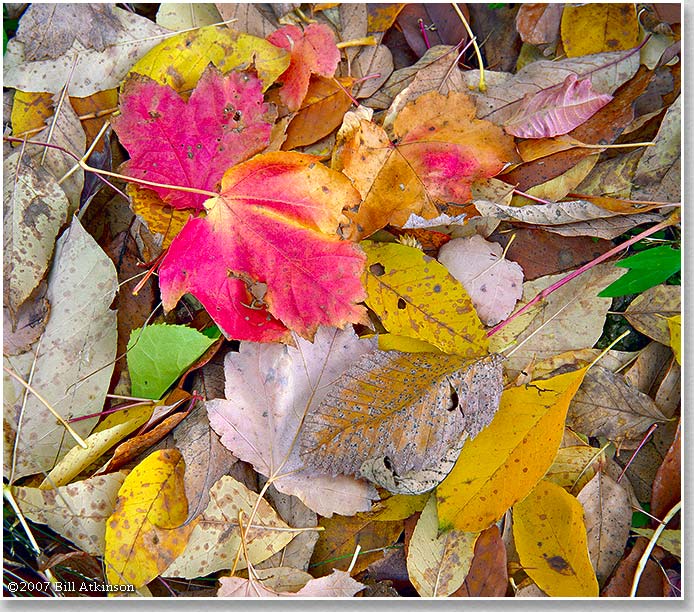
His passion is to explore 'nature' in all it's giuses, from mountain ranges to deserts to the intimate nature of macro photography, using animals, insects and flowers. He especially likes to get the light right, to make full use of all of the colours available to him. This is especially prevalent in the selection of images I have chosen to review hereafter.


The vibrant colours in this image are amazing. Whether they have been enhanced or not is difficult to tell, but the clarity of the blue sky and the gold of the leaves creates a striking contrast.
Conversely, this image doe not need to use shockingly vibrant blue sky. Rather it uses softer tones to create a  very colourful image.

Whilst this image is taken into the sky, it is not the vibrancy of the blue sky that wins over this image. It is the use of the light through the leaves, which creates a mess of colours that all bleed into each other.
Contract this with the dark lines created by the branches and the image is subdivided into numerous segments, each of which has strengths of their own.


I am especially interested in this image as it contrast yellow, reds and blue all in one image. Yet again, the sunlight shining on certain areas exaggerates the golds in the leaves.

I am not even sure if there is a focal point in this image. It is just such a riot of colour that your eye runs riot across the image.


Finally, with this image you get the very best of all worlds. Fantastic use of light in the gold leaves, highlighted in the centre of the image.

Darker greens and blues surround the outer edges, enhancing the lightness and the sunlight. Indeed even the tree trunks draw the eye towards the centre of the image.