Thursday, 13 January 2011

Pinned

Within the scope of my People and Portraits section, I was looking at the works of  Joe Miles and Harry Borden and had a mind to create a series of commercial images. The aim was to use commercial settings and colour, to contrast against the drabness of the background.


Using the above image I cropped it to ensure that the final image is set as an A3 document at 300 dpi

The next step is then to take a background copy layer to protect the original.

Following on from this I was not happy with the sliver 'stud' within the chest and decide to clone it out. I then created another copy layer and entitled it CROP as I was using this to crop out the stud.
Whilst the original aim was to create a contrasting image and the bright red against the grey background did contrast very nicely, I was curious to see how it would look in black and white. So I created a hue/saturation layer and removed the colour. I was pleased with the effect so decided to retain it as a black and white image.
The image looked a little flat and therefore I chose to add a Brightness/Contrast layer and adjusted it until such time as the image was where I wanted it to be.


Once I had done this, I wanted to exaggerate the light onto the model. To achieve this I applied a Gradient fill. This allowed me to darken the edges of the image and leave the centre, over the model, as light as possible. 

This allowed me to arrive at the image below, which is significantly different from the original.

Gold Leaf - Blue Sky

Having researched Bill Atkinson I wanted to use vivid colour when creating some of the autumnal images I was hoping to create. Blue skies and golden leaves contrasting against each other. Hence I started with the following image.

As with all images I needed to crop the original to A3 size at 300 dpi.

The next step was, as usual, to take a background copy of the original to protect it.
Using the clone stamp tool I removed a couple of twigs and blurred images that detracted from the main topic.


I was basically happy with the image and the level of colour in the image. However I wanted to add a little more richness to the colours, which were a little pale. Rather than trying to mess around with levels, I was able to achieve this by reducing the brightness slightly (-8) and slightly increasing the contrast (+ 14)
Ultimately arriving at the final images as below.

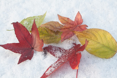
Leaves in the Park


Having chosen the final set of images for my Nature Portfolio it is relevant to describe the steps that I have taken to create the final image of one of these pictures.
 There are a couple of steps that were taken as standard with the images to make sure that they are all A3 sized (420 mm x 297 mm at 300 dpi). This was achieved easily within Photoshop by setting the dimensions of the crop tool and cutting the image to make the final image the correct size.
The next step that was to make sure that a background copy of the original was established to protect the base image.
Looking at certain features I decided to remove the stem on the leaf (top left hand side) and to fill in the snow gap in the centre slightly.

The image looked a little flat and I wanted to increase the vibrancy of the colours. Rather than just increase vibrancy in a vibrancy level, I chose to check the levels and took a dropper onto a section of snow to increase the brightness.
 
This did make the image a little too dark, so I added another adjustment layer to adjust the brightness and contrast. I increased the brightness slightly (+11) and reduced the contrast quite a lot (-30). However, whilst this had the desired effect on the leaves, it blew out the snow, which then needed addressing, as it was simply too bright and lacked detail.
I wanted to darken the image a little so I added a gradient map and then using the eraser tool, removed the leaf detail from this layer. This had the effect of allowing me to work on the snow and the snow alone.


 Finally I once again decided to adjust the brightness/contrast. Leaving the contrast where it was, I darkened the whole image again (-13) to arrive at the final image.

Arriving at the final image as below.


Monday, 10 January 2011

Choosing Final Images - People and Portraits

I wanted to make my theme take a commercial aspect and followed the works of Joe Tierney who uses contrasting colours and textured backgrounds to create a specific look. In addition I have been researching Mark Tierney too. Mark uses colour to great effect in choosing graffiti, or textured, walls to add interest and another dimension to his images.

Bearing this in mind I took a number of images on an industrial park near to where I live. This gave me several images that were good enough to use. My intention was always to try to find some graffiti to add another set of images to compliment the first, but weather and time conspired against me, so I had to consider making do with what I had.

After much searching I chose the following images:


I liked the use of the bright colours and the lines created by the roller shutter doors. However, there were many similar images in these shots and some of them just did not seem to fit. So I trimmed them down to the following:

This left me with a dilemma as there are not 10 images here. After some soul searching I added a couple more back in, but that did notwork and my concerns were echoed in a discussion with Steve on Thursday. So there was nothing for it. I prayed for good weather over the weekend and on Sunday, with a fantastic blue sky and a willing volunteer, I found some graffiti underneath a bridge in Tamworth and was able to take a number of images to complete the portfolio.

The difficulty then, became identifying which ones worked with the previous images. I whittled them down to the following images:


Looking through them and sticking to my original concept, I wanted to use colour in the images, to add additional interest. There were some easy ones to dismiss (there was only one image of my son - so that went). Also, a couple of them were very vibrant, but the area I wanted as the main focal point was ever so slightly not fully in focus - so they went. Leaving the following:
If you look carefully, you will notice that the two images on the left at the bottom are different from their counterparts in the previous image. This is because I was really drawn by the way the light comes into these images and decided that they would look better in black and white. This defeats the colour theory, I know, but the effect of the light is exaggerated as a result, which in itself creates another level of interest.

That left me with six images, from which I needed to choose three. Retaining the colour interest, I removed the B&W duplicate on the middle row and then decided to keep the middle image itself, as it has an interesting pose and shows the colours in the background. That left me with one from three to choose and I decided to retain the very last image as this too had a lot of peripheral colour.

So my last 10 images are as indicated below.

I think that these reflect my original concept of commercial and graffiti and am very much happier with them now, than I was with just the commercial images which I had prior to the weekend.


Thursday, 6 January 2011

Presenting A Portfolio - by Todd Owyoung


In order to do some more research into how best to present my portfolio, I chanced upon these top tips from Todd Owyoung. Todd Owyoung is an internationally published music photographer specializing in concert photography and band portraits.

Some of the information is not totally relevant to where I am in the stage of the programme, as I have now decided on the content of my portfolio; but tips like 4 and 5 (Start Strong - Finish Strong) are especially relevant as to where to insert the images in the running order.

All in all, it is useful to see how others think when creating their work. Anyhow, enough of me - let's see what Todd has to say.
Creating a portfolio of one’s own work can be a daunting task, but it’s an essential part of presenting oneself as a photographer. A top notch book is one of the best ways communicate one’s ability and vision, especially when it can be viewed online and around the world.
Here are eight ways to make yourself look good.
  1. Keep it short and sweet
  2. Show quality
  3. Show range
  4. Start strong
  5. End strong
  6. Put the rest in the middle
  7. Don’t put it to popular vote
  8. Keep it fresh
1) Keep It Short & Sweet
With a portfolio, quantity counts for nothing. If the viewer wants to see more, they’ll look for it. And if they can’t find it, they’ll ask. Both of these consequences are good. I usually aim to include 12-20 images in a photography portfolio.

2) Show Quality

Following up to the first tip, only the best images should go into the portfolio. Consistency and distinction in your images should be a key takeaway. Showing anything but the best is often a waste of time; when you have someone’s attention, make every image count.

3) Show Range

And aside from quality, each image should speak to some aspect of your vision and ability. In choosing images, ask, “What does this image say about me as a photographer?” If multiple images are competing for the same specific message, consider paring down for the sake of efficiency. Expressing range, however, should not be confused with a lack of focus. Every image should work toward a singular goal of expressing your eye and capabilities as a photographer.

4) Start Strong

Start out with a bang. You want to put your second to best shot up front to catch the viewer’s attention. Why the second best? Keep reading.

5) End Strong

With your last image, you want to reinforce everything that has come before and end with the impression of excellence. This position is where your standout image goes, since it’s the last image in the set that the viewer will see.With the last piece, your goal is to leave a mark. The viewer made it to the end, so go for the knock out punch.

6) Put The Rest In The Middle

There is no filler in a portfolio, but everything that isn’t your absolute best should go in the middle. After the lead off image, gradually decrease in image impact until you get to the middle of the series, and then ramp back up for the strong finish.In other words, the highest impact images should be book ends to the images that establish the tone of your work.

7) Don’t Put It To Popular Vote

Bless your friends and family, but portfolios should not be decided by committee; what is popular is not always what makes your eye or execution unique.If need be, I’d suggest paring down a selection of your best images as well as you can and then enlist the keen eye of someone whose taste you trust to make the final selection.

8) Keep It Fresh

Just like seafood, it’s better fresh. Once you’ve established your book, keep it as up to date as possible. Aside from assembling it in the first place, this task is one of the biggest challenges of a great portfolio. As you develop as a photographer and add different elements to your style (or polish it), don’t neglect to reflect that growth in the portfolio.

Assignment 211 - Presenting Photo Images

Having chosen my images, I am now at the point of deciding the best way to present them. There are a number of things to take into consideration such as:

  • Audience
  • Cost
  • Materials
  • Speed

Audience
It is important to think about the people that you are aiming at, with your images. You will need to think of different ways to present the images, depending on the audience that you are trying to appeal to. For example, if you are hoping to get your images to be viewed by the general public, then you will need to consider either printing onto large format canvasses, framing, or other. I am not presenting these images to the public at large so they do not need to appear in a big space. Therefore, it is not necessary to frame or print the pictures.

When creating work for evaluation purposes, for review by a small number of people, a portfolio of images can be created. This requires printing the images an placing them into a presentation folder of some sort.

To reach the world at large, you can use the Internet to present images in an electronic format. There are various dedicated websites that can be chosen but you can also establish your own website, or build up on a blog (as we have done so far within our course).

Family photos can be printed and placed into photo albums, or quite often I publish photos in photo books.

Cost
Cost is a major consideration. To print images in large formats is a very expensive option. Even printing in small formats comes at a price. Therefore, the most cost effective method is to produce electronic versions that can be displayed directly from the computer, or saved to CD/DVD (or other) and viewed by multiple persons.

Materials
When looking at printing, there are a myriad of materials available for printing, ranging from canvas to various types of photographic paper.
Another consideration when looking at printing, is the overall effect that you are trying to achieve. Some colours can be made more vibrant by using a display screen and they may not come out so well in printed format, subject to the materials used.

Speed
If speed is an issue then the quickest way to get images displayed is to simply show them on a computer screen.

Conclusion
I have thought about printing the images, but I like the vibrancy within the nature section especially and fear losing some of this, if I print the images. Also, I will not have the difficult task of working out which paper will give me the result that I want. In addition, printing in A3 will require me to put the finished images into a portfolio folder, which will incur a degree of cost and will mean that I need to take extra time (which is a luxury that I do not have at the moment) to decide on the right portfolio.

Taking all of the above into consideration, I have decided not to print my final images, but to present them as images on a CD/DVD for viewing electronically. The aim will be to burn them to CD/DVD in  JPEG format for instant viewing across multiple platforms.

This will be the quickest method and will ensure that the image that I see on he screen will be the same as the one that the examiners view. There will be no distortion of colour or other, through printing, so I can guarantee the final image is the one that I choose.

Monday, 27 December 2010

Final Image Selection

As previously indicated, trying to select the final images has been a particularly arduous task as there are many that I have taken that I particularly like. However, to arrive at the final selection I identified some 45 images and then began to compare and contrast them side by side.

It is not easy, as you are constantly pulling up a couple if images to look at and then comparing two,  removing one of them and then repeating the exercise. Through this process I managed to get down to some 45 images. From this 45 I finally, after much serious criticism on my behalf, got down to 25.

Using 'Preview' I was able to get these 25 images onto a single screen and to start to look at what images worked well with each other.

My original thoughts had been based on Autumn. I have seen some fantastic images by the likes of Bill Atkinson, where he has taken really vibrant leaves (reds, and golds) and shot them against superb clear blue skies, to create a riot of colour.  Consequently I wanted to create some bright, contrasting, images too. Looking at this as a base on which to build I went through the images, removing items that either did not conjure up Autumn, or did not carry sufficient vibrancy in the colours.
The first images to go therefore, were the flowers. I had done some research into taking close ups of flowers, but this in realty was a distraction, as it took my eye off the Autumn theme. So getting back to the real project they simply did not fit in.

Once again, whilst my images all had pretty much an Autumn theme to them, some of them did not seem to work well with the overall images.  There were some lovely flowers taken outside, but they did not work and some brightly coloured berries, all of which were Autumnal images, but they too, simply did not go with the 'leafy' theme that was beginning to emerge.

So berries and all flowers went. Leaving me with 14 images to filter through.


I then had to focus on which images really stood out against each other and to try to finalise, in my mind, what I was trying to portray. 

Having been very impressed by Andy Small's use of colour and texture, I wanted to emulate some of that. So I looked for those images that (with a final bit of tweaking) could provide me with that. In addition, I wanted to make the best use of colour and light to create images that stood out and had many vibrant contrasting colours. 

The picture of the oak twig in the middle of the screen shot above is very similar to an image by Mark Cranshaw and I had originally wanted to include this within my final portfolio, but when I compared it to the blues and reds, and the brightness of some of the other images, (whilst it does show a good use of light and has good contrasting colours) it simply was too dark compared to the rest - so that was one that went quickly.

There are two images of leaves taken when the heavy frosts came and whilst they are interesting images, they are not vivid enough, when compared to the rest; so they too went. The final image to get removed was the very first one in the selection (top LH corner). I could not get the lighting right and there were simply not enough contrasts to allow it to remain. The image was flat and despite numerous attempts, I was not able to enhance it significantly enough to include it in the final selection.
These are the final 10 images I have selected for my Nature Portfolio. They each have a good range of colour and some very interesting contrasts. Vibrant reds, golds, and blues (as per Bill Atkinson) and the use of white snow, has created a different interest from just the strikingly blue skies. 

Some of these images are very simple, with just one or two leaves in them. However, with these, the aim has been, not only to provide a contrast between the colours but, to realise some detail in the leaves, enhancing the texture of the leaves themselves.

Focusing on one or two leaves within an image, has brought certain leaves to the fore, creating a perspective by enabling these items to stand out and blurring the rest. In some images this is more easy to see than others, and this is largely due to the closeness to the subject (standard lens vs zoom lens really), but in all cases, the aim has been to create a focal point on a particular set of leaves to create that depth and to give some perspective.
The set is split into two really, with one set having blue skies as their backdrop and the other using snow as that contrasting colour. However, in all, the vibrancy of the colours of the leaves stands out and it is this, that finally swayed my judgment to making these my final select 10 images.